Roller banners are deceptively simple. A tall, narrow canvas; a retractable base; a few seconds to catch attention as people walk past. Yet that simplicity is exactly why the design has to work harder. In a busy reception area, exhibition hall, or retail space, your banner isn’t competing with one poster—it’s competing with everything.
The good news: a high-impact roller banner isn’t about cramming in more information or adding louder colours. It’s about making a handful of smart design choices that improve readability, reinforce your message, and guide the eye in the right order. If you’re designing a banner for an upcoming event (or refreshing one that’s started to look tired), these ten tips will help you create something that gets noticed and understood—fast.
The 10 tips that consistently improve roller banner results
1) Start with one job (not five)
Before you touch layout or colour, decide what the banner is for. Is it meant to:
- drive booth footfall,
- explain a service in a reception area,
- promote a limited-time offer,
- or point people to a sign-up or demo?
Pick the primary job and design around it. When a roller banner tries to do everything, it usually does nothing well—because the viewer can’t tell what matters.
2) Write for a three-second scan
Most people will read your banner while moving. That means you need a message hierarchy that works at a glance:
- a punchy headline people can read from several metres away,
- a supporting line that adds clarity,
- then optional detail for those who stop.
If your banner requires “proper reading,” it’s already underperforming. Keep the copy lean and intentional.
3) Choose the right format and spec early
Designing without knowing the final banner size is a classic mistake. Different widths change how much text you can comfortably fit, how large imagery can be, and whether your layout feels balanced or cramped.
It’s also worth understanding the practical differences between stand types, materials, and finishes—especially if the banner will travel regularly. If you’re comparing portable marketing display options to match your use case, lock that decision in before finalising design. You’ll avoid last-minute compromises like shrinking type, cropping key visuals, or losing impact because you guessed the spec.
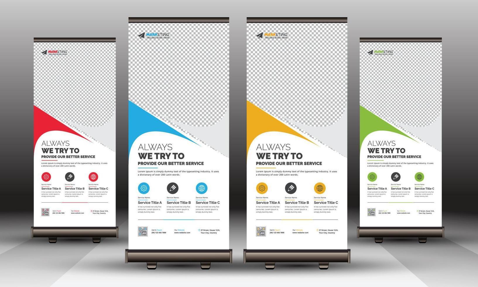
4) Design from the top down (and respect the “dead zone”)
Roller banners have a built-in constraint: the bottom portion can be obscured by the stand mechanism, or simply missed because people don’t look down. Treat the bottom 10–15% as a low-priority zone.
Put the most important elements near eye level:
- headline in the upper third,
- key visual or benefit statement in the middle,
- supporting details lower down.
If your call-to-action is essential, keep it above the base—don’t bury it where feet, bags, and crowd lines will hide it.
5) Make your headline a benefit, not a label
“Managed IT Services” is a label. “Fix IT issues before they stop your team” is a benefit. One tells people what you are; the other tells them why they should care.
A strong headline:
- speaks to a problem or outcome,
- uses plain language,
- avoids internal jargon.
If you want to include what you do, put it in the subheading. Lead with the payoff.
6) Use one clear call-to-action
Decide what you want someone to do next: scan a QR code, visit a URL, book a demo, or walk to a counter. Then make that action obvious and easy.
A practical rule: if your banner includes more than one primary CTA, you’re making the viewer choose—and most won’t. One action, presented confidently, tends to outperform a scatter of options.
7) Treat typography like a performance tool
Type choices often determine whether your banner is readable from three metres or only from thirty centimetres.
A few field-tested guidelines:
- Use one font family (two at most) to keep things cohesive.
- Prioritise high x-height, clean sans-serif faces for distance readability.
- Increase line spacing slightly to prevent text blocks from “greying out.”
- Avoid long paragraphs; break copy into short, scannable lines.
And watch contrast: light grey text on white might look tasteful on your monitor, but it disappears under harsh venue lighting.
8) Choose imagery that still works from across the room
Stock photos can work, but only if they communicate instantly. Complicated scenes, tiny details, or busy backgrounds become visual noise when viewed at a distance.
Aim for:
- a single, relevant focal subject,
- high resolution (print quality matters more than you think),
- generous negative space for text overlays.
If you use icons, make them bold and simple. Thin-line icons often vanish once printed and viewed from a few steps away.
9) Use colour with intent (and test it in context)
Colour should guide attention, not decorate the page. Think in roles:
- a dominant brand colour for recognition,
- a contrasting accent colour for the CTA,
- neutral space to let elements breathe.
Also consider where the banner will sit. A dark banner in a dim corridor can look heavy; a pale banner in a bright atrium can wash out. If you can, mock it up on a photo of the real environment. It’s a small step that prevents costly misjudgements.
10) Pre-flight your artwork like a printer (not a designer)
Roller banner artwork fails in predictable ways: low-res logos, missing bleed, QR codes that scan on screen but not in print, and colours that shift unexpectedly.
Before you export:
- confirm final size and safe areas,
- export at print-ready resolution (typically 300 dpi at size, where applicable),
- convert images properly and embed fonts,
- test QR codes from a printed proof (even an A4 test helps),
- proofread aloud—your brain skips familiar mistakes when you skim.
A ten-minute pre-flight check routinely saves days of reprints and “we’ll fix it next time” regret.
Bringing it together: simple, bold, readable
A roller banner is not a brochure on a stick. It’s a visual handshake: quick, confident, and easy to understand. If you focus on one purpose, build a clear hierarchy, and respect the realities of distance viewing, your design will do what it’s supposed to do—stop people, tell them something meaningful, and make the next step obvious.
When in doubt, simplify. The most effective banners aren’t the ones that shout the loudest; they’re the ones that communicate the fastest.